
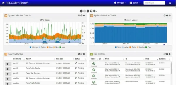
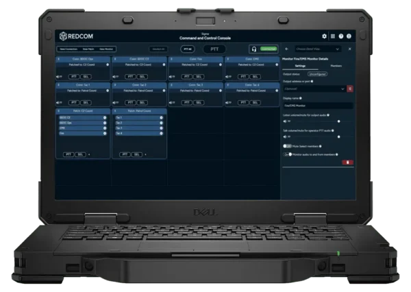
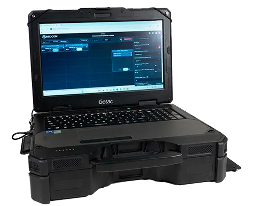
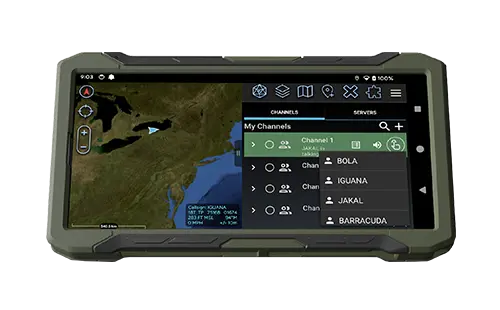


REDCOM Laboratories, Inc., a leading developer and supplier of advanced tactical communications systems for the U.S. Department of Defense (DoD), has completed an extensive rebranding effort centered around a new corporate logo. After maintaining the same logo since the company’s founding in 1978, this new brand identity better reflects REDCOM’s current mission of developing the world’s most reliable and interoperable Command and Control (C2) communications solutions.
“The previous REDCOM logo had a great run over the past 45 years, but the REDCOM of today is a vastly different company than it was even five or ten years ago. It was time to update our logo to represent who we are going forward: an innovative and nimble R&D company that solves unique communication challenges for mission-critical applications,” said Mike Gerenser, Director of Marketing at REDCOM Laboratories, Inc. “The new logo evokes both a three-dimensional shape and a connected network. A hidden “R” in the negative space at the center of the logo represents the REDCOM technology that brings disparate communication paths together.”
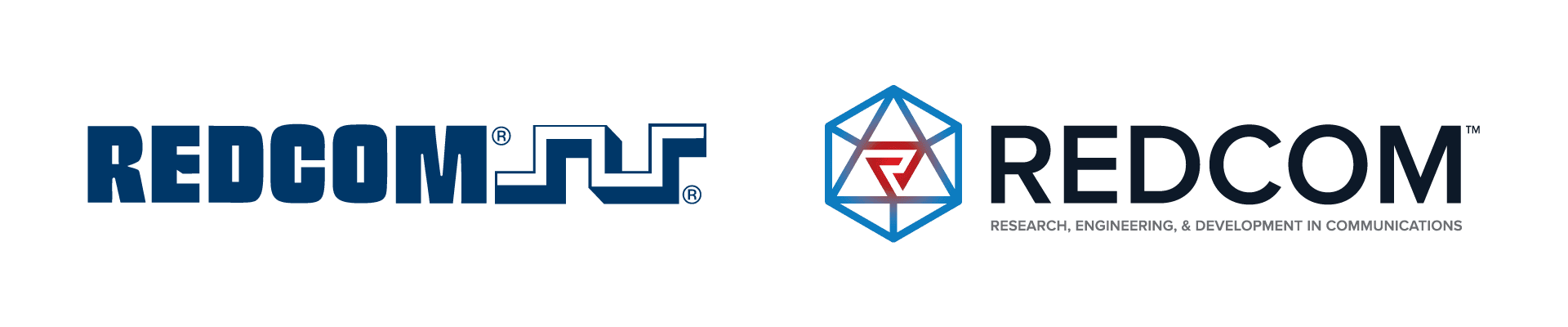
REDCOM’s old logo (left) was designed in 1978, featuring heavy lettering and a square digital wave. The new logo (right) implies a greater sense of connectivity and flexibility, featuring a hidden “R” in the center of the logo mark.
REDCOM’s new brand identity embodies a renewed sense of purpose but is still rooted in the company’s heritage of developing unique communications hardware and software. When the company was founded in 1978, the name REDCOM was chosen as an acronym for Research, Engineering, and Development in Communications. This important tagline is now a key component of the company’s updated brand identity.
If you’re interested in learning more about REDCOM’s C2 communications solutions, visit the company website at www.redcom.com or get in touch with a solutions advisor at sales@redcom.com.